
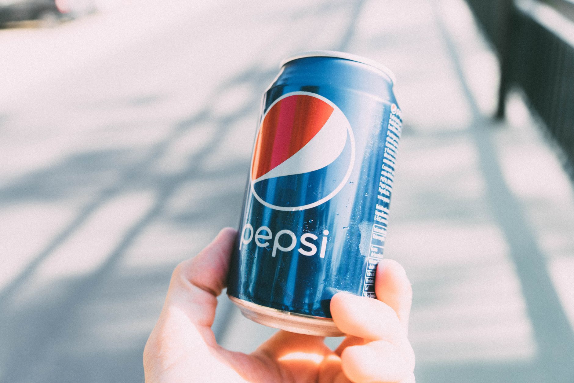
Pepsi, a brand that has stood the test of time, is not just known for its refreshing soda but also for its iconic logo changes throughout the years. Understanding the evolution of the Pepsi logo can provide insights into branding and marketing strategies, particularly in the food and beverage industry. With a history dating back to the late 19th century, the logo transformations echo trends and tastes that may inspire food and drink branding today.
This article explores the timeline of Pepsi’s logo changes, why these modifications happen, and how they represent more than just a soft drink, but a cultural phenomenon that can inspire other food and drink marketers too.
When Did Pepsi Change Their Logo?
Pepsi has undergone multiple logo changes since its inception in 1893. The most significant redesigns occurred in 1962, 1973, 1987, 1991, and most recently in 2023. Each change reflects a shift in contemporary design trends, marketing strategies, and consumer preferences.
The Evolution of Pepsi’s Logo
The journey of Pepsi’s logo is a fascinating reflection of changing times, tastes, and branding philosophies. Here’s a detailed look at pivotal moments in this evolution.
1893 – The Beginning
Originally produced as “Brad’s Drink,” the initial logo was a simple, text-based design without any graphical elements. It featured the drink’s name in a straightforward font, aiming for clarity over style.
1898 – Rebranding to Pepsi-Cola
In 1898, the beverage was renamed Pepsi-Cola, featuring a more decorative script in its logo. This logo showcased a more playful typeface that would engage consumers’ imagination. This was the beginning of Pepsi’s identity as a refreshment brand.
1936 – Introduction of the Circular Logo
The first circular logo was introduced in 1936, depicting the text “Pepsi-Cola” inside a red and blue circle. This design hinted at the future iconic globe shape. It began to set a tone of modernity and dynamism, aligning with the lively spirit of the soda era.
1962 – The First Major Redesign
In 1962, Pepsi made drastic changes by simplifying the logo, replacing the intricate script with a bold sans-serif typeface. The circle began to take on a more recognizable “Pepsi Globe” shape, featuring red, white, and blue colors. This logo was designed to resonate with a younger, more dynamic audience as the brand repositioned itself in a competitive soda market.
1973 – A Minimalist Update
The 1973 iteration of the logo featured even further simplifications. The typeface changed again, becoming slimmer and more modern. The colors in the globe were maintained but became more vibrant, showcasing a balanced aesthetic approach aimed at enhancing the brand’s identity in advertising.
1987 – Embracing a New Era
In 1987, Pepsi went for a major overhaul. The logo featured a more stylized globe and a bold new font. The iconic Pepsi swirl became more pronounced, emphasizing the brand’s energetic image. This version appealed to the growing youth culture of the time, aiming to tap into the innovation and creativity of the era.
1991 – The 90s Refresh
The 1991 logo further emphasized the dynamic swirl of colors and was characterized by softer edges. The changes aligned Pepsi with the mood of the 90s, making it appear more approachable and friendly. The logo also focused on creating a sense of playfulness which complemented the vibrant advertising campaigns ongoing during that period.
2008 – Modern Minimalism
In 2008, a new redesign was introduced that adopted a flatter design aesthetic. The red, white, and blue palette persisted, while the logo became less three-dimensional. This change was reflective of broader trends in logo design during the late 2000s, preferring clean and minimalistic logos, as seen in many tech and retail branding changes.
2023 – The Latest Update
In 2023, Pepsi unveiled yet another logo transformation. This time, the logo looked back to its roots, resembling the 1962 version while integrating contemporary design elements. This balance of nostalgia and modernity reflects the brand’s self-awareness and consistency while staying relevant in today’s competitive market.
Why Brands Change Their Logos
Changing a brand logo may seem superficial, but it’s often motivated by deeper factors. Here are the key reasons a company like Pepsi might update its logos:
- To Stay Relevant: Over time, consumer preferences and design trends change. An updated logo can help a brand stay aligned with current tastes.
- Rebranding Efforts: Companies may evolve to reflect new ideas, values, or market focus. A logo change can signal these shifts to consumers.
- Competitive Edge: As competitors revamp their branding, companies often follow suit to differentiate themselves in the crowded market.
- To Refresh a Tired Brand: Sometimes, a well-known logo can become stale, and a fresh design can invigorate interest and excitement around a product.
Lessons for Food and Beverage Branding
Pepsi’s logo changes provide valuable lessons for food and beverage marketers. Here are some insights that can apply to any food brand:
Stay Updated with Trends
Design trends evolve; what was appealing a few years ago may not resonate with today’s consumers. Keeping an eye on emerging trends can help you maintain a fresh brand image.
Reflect Your Value Proposition
A logo should encapsulate the essence and values of the brand. Consider what you want your brand to represent and ensure those principles are reflected in your visual identity.
Know Your Audience
Understanding your target demographic is crucial. A logo appealing to younger audiences may not resonate with older consumers. Tailor your branding to reflect the preferences of your intended audience.
Consistency is Key
While bringing in a fresh look is beneficial, too many changes can confuse consumers. Aim for a logo that can evolve without losing brand recognition. You want consumers to recognize your product at a glance.
Communicate Change Effectively
When undergoing significant changes, ensure that your marketing strategy effectively communicates the reasons behind the updates. Use storytelling and highlight how your rebranding aligns with your mission and vision.
Conclusion
Pepsi’s logo history reflects much more than just a series of design changes. It illustrates the company’s ability to adapt and evolve in an ever-changing market landscape. As the food and beverage industry continues to grow and develop, paying attention to branding strategies like those of Pepsi can inspire marketers and entrepreneurs alike. Understanding the impact of a logo change can lead to strategic decisions that resonate with consumers and keep brands relevant.
Explore more about branding in the food and beverage industry or discover the latest cooking techniques and food pairing tips to enhance your culinary skills. Whether you’re looking for helpful meal prep ideas or insights into flavor pairings, there are abundant resources available to guide you on your cooking journey.